
 Through innovation in design and choice of content, my tenure as editor of INTERMEDIA has been one of a constant exploration of the relationship between the aesthetic and informational nature of art and literary communication.
In communication theory, entropy is a measure of disorder, of misinformation (information leads to growth and change); entropy also measures the lack of information about the structure of a system, information that may be dislocated between sender and receiver. The initial goals of INTERMEDIA were to assist artists and writers in acquiring more information within their areas of interest, and to present new art and literature in a more accessible format.
The first three issues of INTERMEDIA published art and literary information (“yellow-pages” information such as small press listings, directories of support organizations, bibliographies of resource materials) along with art and literature which explored new forms of artistic communication – xerox art, new music, visual poetry, performance art. It quickly became apparent that new formats were required to heighten the informational content of the art itself (conceptual and ideational information, different ways of seeing) and subsequent issues began to explore new structures.
The fourth issue was a departure from previous 8 x 11 formats. Because of the non-linear nature of much of the work – experimental in both form and content – many of the pieces could not be matched up to sequential 8 x 11 pages. I designed a tabloid newspaper which quickly became a highly acclaimed anthology of current literary writings. My experience with this format lead me to further perceive how the form of a work affected the informational nature of the content. For example, a short story presented on two facing 17 x 22 sheets could have a different impact than when presented through eight 8 X 11 pages. The impact of the piece was more direct and immediate ,the information was less entropic, ie, the interaction between reader and writer was mediated by fewer visual and textual encumbrances.
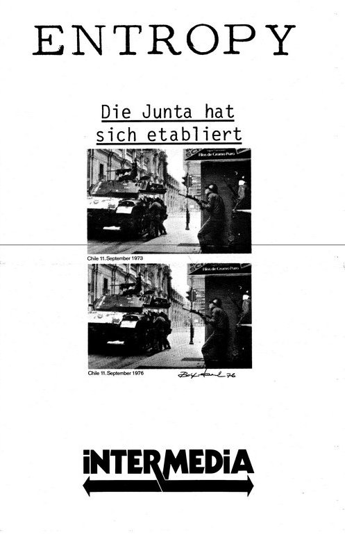
The fifth and sixth issues of INTERMEDIA attempted to carry this concept further, though keying in exclusively on the visual arts (though many of the artists were presenting works in literary formats). The fifth issue was designed as a tabloid compendium of broadside-posters, each sheet a separate 17 x 22 artistic module. Many of the posters were self-reflexive — reflecting an artistic concern with both the aesthetic and informational nature of the piece: a collage of news clippings on a new-wave music group, a visual text on the role of waitresses in our culture, a semiotic study of obscene phone calls, a conceptual photography piece in which a text from Lenin is juxtaposed with an x-ray of a hand.
The sixth issue was housed in a box, containing works which could no longer be bound into newspaper or magazine form – postcards, broadsides, folders, posters, odd-sized art pieces. The seventh issue of INTERMEDIA returned to magazine format, an 8 x 11 bound journal exploring the variety of ways in which a “story” can be told – photographic serialization, prose-poetry, short story, visual language, play form, and image manipulation. Much of the material in this issue was in linear story form, and thus lent itself to standard 8 x 11 pagination.
In both content and design, INTERMEDIA has been a successful experiment and innovation in the presentation of art and literary communication – from the traditional short story to the wildest linguistic experimentation.